perfect floor plan of 112 East 19th Street loft emphasizes volume
sometimes, simple is the best solution for a Manhattan loft layout
I had put aside the “1,950 sq ft” Manhattan loft #8F at 112 East 19 Street (Ruggles House) when I added it to my Master List of downtown Manhattan loft sales earlier this month (it closed on May 1, but the deed wasn’t filed until the end of last month). The sales price ($3.2mm, or $1,641/ft) is kinda sorta impressive in this somewhat stodgy coop (truly) in the heart of Gramercy, and one of the pioneering coop conversions (1973!). But it was the exceedingly simple, exceedingly efficient floor plan that caused me to bank the headline above and a link to the listing for a future (now, present) Manhattan Loft Guy post. Does it seem obvious that this is the ideal 2-bedroom floor plan for this footprint?

simple squares + rectangles that leave a great Great Room
In real life, those straight lines permit the sense of volume evident in this photo:

window after window, beam after beam, the space just rolls away from you …
The simple design lends itself easily to being broken up, not by walls, but by furnishings, into discrete areas (first, dining, then two seating areas). The 11 foot ceilings and huge windows help make the space feel as large as possible, while the beams give the high enough focus points to enhance the sense of distance.
Again, this is simple stuff, but (to me) there is a subtlety about the result that impressed me even before I looked back at prior iterations of this space. In fact, it used to look like this:

an extra bedroom, but not many long straight lines or right angles
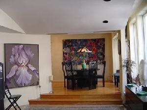
I can’t find any publicly available listing photos that go with the floor plan above, which is taken from the 2010 listing that generated a sale at $2.025mm. But here’s what the loft looked like in 2005, when (per our listing data base) it was offered for sale without selling:

raised dining area, dropped ceiling, + the edge of the curved wall, with fewer windows in the (not so great) room
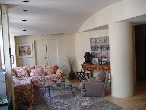
And here is the same room, taken from the dining area, with the third bedroom at the end:

the other end of the curved wall is at far right, with another curve at the ceiling + the column rounded off
There is little sense of ‘volume’ in the space, as pictured in 2005. To me, the architecture is too clever by half: it was obviously done on purpose to offer rounded surfaces of various kinds (the massive column!) and to break up the space radically. Note, especially, the experience on entry, from the floor plan: you enter and make a hard right turn before bumping into that (angled!) wall, at which point you won’t have much sense of the windows, or the width of that window wall. The dropped ceiling (of various heights) is of the same mindset that raised the flooring at the dining area end of the open space. Again, obviously on purpose.
Now look again at the ‘now’ floorpan and main current photo: the ceiling is evidently dropped in the foyer, but the experience of quickly stepping down into the great room and quickly seeing the width and height of the main space is a completely different experience than the (sad!) visitors before 2011 had. You wouldn’t know that the 2005 photo just above and the 2015 main listing photo pictured the same space.
This is why I love looking at lofts, especially at lofts that change over time (and have listing photos and floor plans that help appreciate the changes): you see that true loft spaces, with their high ceilings, large windows and few load-bearing elements, lend themselves to a variety of uses. In a prewar apartment, you rarely even can open up walls (if permitted by the coop board, you’d likely mess with some platonic proportions), so the renovations tend to be more cosmetic; with lofts, as I often say, you can ‘erase the lines’ and start over, respecting only the limitations of specific plumbing stacks.
The folks who created the open #8F loft did so sometime after buying in May 2010 at $2.025mm. They resisted the invitation of the 2010 broker babble to just dress the space up:
With a little TLC … you can own and create a fabulous apartment in the heart of Gramercy Park.
The scale of their renovation is less evident from the two floor plans than from the photos or the new listing description. (After all, the plumbing rooms are essentially where they were, and the two 2015 bedrooms are where two were in 2010, though they are configured very differently.)
meticulously renovated …. Sprawling and sundrenched, the grand scale home has 11-foot beamed ceilings, beautiful prewar architectural details and has light streaming in from 12 windows across 3 exposures. A 12-foot entry foyer leads into a grand entertaining expanse spanning almost 50-feet with 8 enormous north facing windows. The state-of-the-art chef’s kitchen has ample room for dining and has been outfitted with custom cabinetry, Samsung double-door fridge, Bosch dishwasher, a Bertazzoni Stove and temperature-controlled wine storage. This airy, light-filled residence features pristine wide-plank white oak flooring throughout and there is a washer/dryer. The serene master suite has a luxuriously appointed bathroom with a generous double-shower and a sprawling custom-designed walk-in closet. A second spacious bedroom suite situated along the East wing of the home enjoys open city views and features ample closets and an impeccably appointed bathroom.
Regular readers of Manhattan Loft Guy may be surprised that there are few elisions in the broker babble boxed above. While in most cases the comments such as “grand scale”, “grand entertaining expanse”, and even “airy, light-filled” are examples of agents who simply try too hard, here they accurately describe the space (granted, I left in the cliche “serene master”, but the agent earned it). And, intentionally or not, these flights of whimsy highlight the differences that the 2015 sellers made after becoming 2010 buyers. None of these descriptions (“grand scale”, “grand entertaining expanse”, “airy, light-filled”) could fairly have been used in the 2010 babble.
If you still need convincing, I’ve not done this well, but here’s another 2015 photo, against which to compare the 2005 raised dining area photo above:

how could this be the same loft??
I hope these folks made a ton of money by creating a beautiful (simple!) Gramercy loft
In this round of Guess The Budget, I am clearly rooting for the 2010-buyers-turned-2015-sellers-after-renovating. We start with a simple timing adjustment, guesstimating what the loft would have been worth in 2015 had they not radically improved it. Using the StreetEasy Manhattan Condo Index as a single number proxy to represent the change the overall Manhattan residential real estate market, the loft bought at $2.025mm in May 2010 would be worth about $2.7mm now (the Index is up 33% from May 2010 to February 2015, the [still!!] last month in the Index). They just sold it for $3.2mm. Uh-oh ….
That leaves them (only) $500,000 to work with in a renovation budget. Any more than that, and they realized less than $1 in value for every dollar in the renovation budget; any less than that, and they got more than par. What are the chances that they could have done all this work (ceilings and floors, kitchen and baths, and [per our listing system] new windows) for less than $256/ft? Possible, but I’m worried ….
The finishes in this loft off Gramercy Park are not babbled quite as enthusiastically as the renovated-then-sold lofts I hit in a sequence earlier this month.
- the penthouse in my June 11, spectacular renovation of Village penthouse loft is not quite as well received as renovator hoped at 42 East 12 Street, generated more than $1 in value for every $1 spent only if that (yes) spectacular renovation cost less than $400/ft (not likely, given the scale of that work)
- the high-kicking renovation in my June 4, million dollar renovation at 144 West 27th Street?, was renovated “beyond aesthetic reproach”, so probably didn’t generate much more than the renovation budget (if it accomplished even parity)
- the (yes) spectacular renovation in my June 5, there are spectacular Manhattan loft renovations, then there’s this 54 East 11 Street loft renovation, very likely generated significantly more value than the renovation budget, dollar for dollar (I guessed “about $1.78 in value for every $1 spent”)
I worry about the Ruggles House sellers, because I so much like what they did (seemingly simple, delightfully rendered), and because $256/ft might not have covered it. Maybe the floor and ceiling work is not as expensive as I’d fear. And they didn’t move any plumbing, or install central air.
In a very real sense, the Guess The Budget game I play is irrelevant to their experience. They spent money well, in creating a new space that was far superior to the space that they bought. They got the benefit of living in that wonderful space for four years or so. I obviously have no idea what their financial situation is, or where they went after leaving East 19th Street, but I have no reason to guess they were disappointed in the round trip experience.
I will continue to play the Guess The Budget game, of course. For an outsider, it’s fun.

Follow Us!